 This is a remote sensing image of the Rio Grand. There is a set of different images that show the changes over time in regards to the size and landscape changes to the area. The interesting thing I noticed about the images is that color changes describe the changes over time. It does not require on scene data retrieval to evaluate the changes.
Sunday, October 19, 2008
Remote Sensor
This is a remote sensing image of the Rio Grand. There is a set of different images that show the changes over time in regards to the size and landscape changes to the area. The interesting thing I noticed about the images is that color changes describe the changes over time. It does not require on scene data retrieval to evaluate the changes.Wednesday, October 1, 2008
LIDAR Map

http://www.nasa.gov/centers/goddard/images/content/67414main_lidar_changes.jpg
This is a sample of Mt. St. Helen, taken by NASA. The LIDAR (Light Detecting and Ranging) measures properties of scattered light to find range and/or other information of a distant target by using an optical remote sensor. The information retrieved can track changes over time in a particular area.
Wednesday, September 24, 2008
Classed choropleth maps
 http://www.ilstu.edu/~jrcarter/Geo204/Choro/map-AmFact-4round-green-80pct.jpg
Choropleth maps are used to compare information throughout the map. For instance, this map compares the number of males per every hundred females within that state. It uses shades of colors for different numbers of males. The darker the green the more males compared to every hundred females. Each area or class is assigned a different symbol or color in a classed choropleth map.
Tuesday, September 23, 2008
Isopleth
 http://www.idahogeology.org/Services/Hydrogeology/PortneufGroundWaterGuardian/my_drinking_water/hotwater_topics/water_capdraft/watercap_fig3.jpg
This is an isopleth image of a detailed water balance of the upper part of the lower Portneuf River valley. The purpose of an isopleth image is to show features of meteorological charts, connecting points which have an equal value of some variable at a given time and spatial area. This shows the possibilities of future water output over time. It compares what is seen at a particular time to a possibility in the future for that feature. The isopleth uses contour lines to demonstrate the possible water levels over different times.
Doppler Radar

http://www.ci.ocoee.fl.us/General/Images/DopplerRadar.jpg
This image is a Doppler radar screen from the well known weather channel. Doppler radar images uses an antenna to send a microwave out and the wave returns to the antenna gathering information. In weather, the antenna sends out pulses and based on the precipitation determines the strength of the returned wave. Doppler affect is used in many different items such as radar guns, used by law enforcement. The same affect is used to create images of areas to show rain and storms. Doppler radar does not just mean weather radar. Doppler is the effect of the antenna.
Monday, September 22, 2008
Infrared aerial photo

http://ecosystems.mbl.edu/pie/data/MAP/irparker.jpg
This is an infrared aerial photo of water bodies of the Plum Island Sound Estuary in northeastern Massachusetts . The purpose of an infrared aerial photo is show change over time. It uses portions of spectrum lights to watch changes within the area. It can show how diseases and toxins affect certain areas over time. If the lights are filtered properly then this type of photo can explain important information. It is used by a lot of research groups.
Wednesday, September 17, 2008
Planimetric Map

The above map is a Planimetric Map or sometimes called a line map. A planimetric map shows locations on only a horizontal level. It does not show elevation like the topographic map. Planimetric maps are more likely to be computer generated images such as the one above. These types of maps are simple to read, usually displaying roadways, buildings, and other physical locations.
Topographic Map
 http://pics.city-data.com/topoz/ztm4562.png
This is a very important map to me. This is an example of a topographic map. It describes landmarks and landscapes to demonstrate the area. Most topographic maps show contour lines to demonstrate hills and heights of the land. This map shows Camp Blanding, which is in the middle of Florida. I use a topographic map of this location every year for military training.
Correlation Matrix

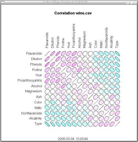
A correlation matrix uses two or more variables to describe something. One variable is a correlation of the other. The above matrix describes an unknown area. It shows how certain items, such as different types of pollution and temperature affect each other. It is used to describe mathematical information about a place. A correlation matrix can also be used to describe distances. One city location compared to another affects the distance between each other. A lot of atlases have correlation matrices of mileages showing different cities.
Star Plots
 http://www.math.yorku.ca/SCS/Gallery/images/starcrim2.gif
A star plot is a multi-data representation of information. It uses various points to display the information within the plot. It uses spokes (lines) to connect the points within it. The data length of a spoke is proportional to the magnitude of the variable for the data point relative to the maximum magnitude of the variable across all data points. The above map is an example of a star plot, showing the crime rates within certain cities. It does not show the data used to mark each point but it shows how each point is different than other cities and how variables affect the image. The points given in each give the appearance of the star giving the name a star plot.
Subscribe to:
Comments (Atom)